
Previously, I had chosen three artwork that I really liked. This is the phase where I put these pictures into
Photoshop and work on them. I have put all my three artwork below describing each in detailed. Furthermore, I have included the steps that lead me to my final work for the readers' better understanding. Have fun reading!
Photoshop and work on them. I have put all my three artwork below describing each in detailed. Furthermore, I have included the steps that lead me to my final work for the readers' better understanding. Have fun reading!
Artwork Title : Just Being Human
Visual Treatment
i)Brief Description: This painting signifies the complicated human being. It is meant to give an appearance as though it has been painted on a stone wall by people from long ago. Thus, from before till this very day, we are trying to figure out the human being.
ii)Art Movement: Synthetic Cubism
iii)Reference Artist: Juan Gris
iv)Theme: Family, Hope & Dream Series
v)Idea & Concept: Humans are interesting and fascinating creatures. They display various patterns of behaviors that when you actually take time to think about it, you are just full of wonder. Why do humans behave in this way? Is it true that the angel and demon lives inside them? Greed, wants, thoughts! Challenges and obstacles. How much worse of better will things get?
Creating "Just Being Human" in Photoshop:
1. Firstly, I open the Photoshop CS 5 Extended software. Then I opened up a new sheet of worksheet (16inch x 20 inch : 300 pixels). File --> New --> width: 16 inch ---> height: 20 inch

2. Then I imported the "Just Being Human" sketch from another folder. Drag & Drop it onto the Photoshop worksheet.

3. I then enlarged the picture while pressing down Shift so that the picture will keep its original proportions. After that, I flattened the picture to its background so that i will be able to desaturate the image. Image --> Adjustments --> Desaturate

4. I enlarged the imaging using the magnifying tool so that I would be able to create a more detailed artwork. I used the pen tool to trace the shapes one at a time.

5. I traced each shape in a separate layer so that I would be able to make necessary adjustments later. Furthermore, using different layers for different objects and shapes allows me to manipulate them individually. Once I had trace the particular shape that I wanted, I added colour to it. Layer --> New Fill Layer --> Gradient.

6. As you can see, my artwork has various outstanding geometric shapes; then there are the smalled shaped inside of them. In order to avoid the inner shapes to spill out, I clip-masked them. The layers that were to be clip-masked should be above the layer that you want it masked in. Right click on the respective layer --> Create Clipping Mask

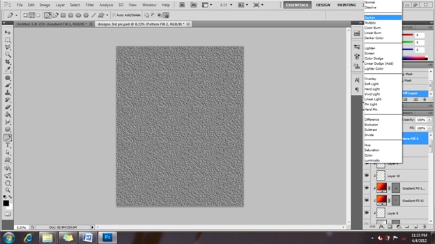
7. Once I have completed colouring each of the shapes, I added texture to it. This is because I wanted the artwork to stand out more and give a 3D effect instead of a plain piece of work. Layer --> New Fill Layer --> Pattern.

8. Then, I picked the texture that I found interesting. I also increased the scale to its maximum (1000%) so that it is more visible on my artwork.

9. I adjusted the layer to "darken" and set the opacity to 70% and fill to 72% to give my painting a solid look.
11. My rough sketch of "Just Being Human"

12. My final design of "Just Being Human"

__________________________________________________________________________________________________________
Visual Treatment
i)Brief Description: This painting signifies the various dreams we have. They could be sweet dreams and even nightmares. The Birds in the artwork symbolize the human being, different shapes, sized and colours. They are a family of good and evil.
ii)Art Movement: Synthetic Cubism
iii)Reference Artist: Juan Gris
iv)Theme: Family, Hope & Dream Series
v)Idea & Concept: Humans are interesting and fascinating creatures. They display various patterns of behaviors that when you actually take time to think about it, you are just full of wonder. Why do humans behave in this way? Is it true that the angel and demon lives inside them? Greed, wants, thoughts! Challenges and obstacles. How much worse of better will things get? Family?
Creating "Colourful Dreams" in Photoshop:
1. As usual, I first opened the Photoshop software. Then I created a new worksheet (16inch x 20inch : 300 pixels). File --> New --> width: 16inch --> Height: 20inch --> Pixel resolution: 300. I imported my 2nd sketch using the same method as the above (Drag and Drop from another folder onto the worksheet). Next, i enlarged my sketch to fit the whole worksheet while pressing down Shift to maintain the current proportion of the sketch.

2. I flattened the layer with the sketch with the background by right clicking on the layer --> Flatten. After that, i desaturated the image. Image --> Adjustments --> Desaturate.

3. Next, I changed the levels of the image to make it look darker for later use. Image --> Adjustments --> Levels.

4. I enlarged the image so that i would be able to work on it in more detailed. I created a new layer. Using the pen took, i traced each of the shapes that I wanted. I separated each shape into different layers to make my work much easier and also, this way, I would be able to make changes to individual parts later without messing up the whole artwork.

5. After tracing a particular shape, I added colour into it. Layer --> New Fill Layer --> Gradient. I kept doing this till the whole artwork had been drawn out in Photoshop and filled with colours.

6. After completing that procedure, I noticed that my artwork is rather too bright. To match my reference artist's artwork, I needed to make my picture more darker. Thus, I added another layer and filled it will black colour. Layer --> New Fill Layer --> Solid.

7. As you can see below, the new layer is covering my actual artwork. In order to make it blend with my artwork and show coherence, I overlay-ed the layer on top of my artwork.

8. Lastly, I added texture to give my artwork a rough field. I picked the texture that made my artwork looks as though it had been painted on a rough wall. I overlay-ed the texture too so that it would blend with my artwork to give it a more natural look.

9. My rough sketch of "Colourful Dreams".

10. My final artwork of "Colourful Dreams".

__________________________________________________________________________________________________________
Artwork Title : Burning in Hell on Earth
Visual Treatment
i)Brief Description: This artwork resembles a painting done on a tree bark. The darkened colours give it a fade look as though this painting was done a very long time ago. Also, this artwork is created in a particular way to portray an oil painting texture and uniquely, been painted in a circular manner.
ii)Art Movement: Synthetic Cubism
ii)Art Movement: Synthetic Cubism
iii)Reference Artist: Juan Gris
iv)Theme: Family, Hope & Dream Series
v)Idea & Concept: People are so different from each other in many aspects such as thoughts, believes, race, religion, gender and more. Often we see that there differences break people apart as they seem to never be able to get along with each other. However, most beautiful amazing things are actually different objects that unite together. As shown in this posture, although the dove, which resembles the human beings, is in various colours, it gives a coherence in the painting. Also, the fire around the painting resembles the challenges that we face as they are from everywhere. Nevertheless, when you look closely at the painting, you will notice that hope is born within which is the key for the survival of the human race. In addition to that, as you can see the dove, looks behind and so should we; we should often look back into our past so that we know for sure how far we have come now and this will help us go on further in life with a new HOPE.
Creating "Burning in Hell on Earth" in Photoshop:
1. Firstly, I opened the Photoshop software. Then i created a new worksheet (16inch x 20 inch : 300 pixels). File --> New --> Width: 16inch --> Height: 20inch --> Pixel resolution: 300. I imported my sketch using the same Drag and Drop method from another folder onto the worksheet in Photoshop.

2. While pressing down Shift, I enlarged my sketch to fit the whole area of the worksheet that i had created earlier. The reason for pressing Shift is because i wanted to maintain the sketch's current proportion onto the worksheet.

3. After that, I flattened the layer with its background. Right click on the layer --> Flatten Image. This is done so that it is much easier for me to work on the artwork. Also, this process enables me to carry on with my next step.

4. Similar to my previous two artwork, I desaturated this image as well because I did not want the colours interrupting my work on it. Image --> Adjustments --> Desaturate.

5. Then, I changed the image's level to enhance the dark and light colours for future use. Image --> Adjustments --> Levels.

6. I enlarged my image using the zoom tool because I wanted to be able to see all the tiny details and fix them. This would give my artwork a better enhanced look once it is done.

7. For this artwork, I used the Polygonal Lasso Tool and also the Pen tool to create the different shapes. When using the Polygonal Lasso Tool, I used Warp to make the curved ages while when using the Pen took, i just added more points and pulled them to create the curved shape. Nevertheless, I created each shape in separate layers so that I would be able to manipulate and edit them individually.

8. After tracing the wanted shape, i added colour to it. When using the Pen tool, i could apply gradient colours while when using the Polygonal Lasso Tool, i was only able to apply solid colour. Layer --> New Fill Layer --> Gradient.

9. Once I have picked the type of gradient that I wanted, I adjusted the darkness and lightness of it to suite my artwork. I did this same steps over and over again till all of my artwork was filled with the correct shapes and colours.

10. I noticed that my artwork was once again too bright. So, i added a new layer and filled it with solid back colour. This way, it would resemble more like my reference artist's artwork because most of his paintings are quite dark. Layer --> New Fill Layer --> Solid. After that, I overlay-ed the layer to blend with the other colours of my artwork.

11. Then I added texture to it so that I would portray a 3D effect. Layer --> New Fill Layer --> Pattern.

12. I choice the pattern that gave my artwork the look as thought it has been painted on a tree bark. I overlay-ed the texture too so that i blends with the art work. In addition to that, i downloaded another texture which is in circular motion from google and added to my artwork as well. I darkened its colours so that i enhances the lines on this artwork.1. Firstly, I opened the Photoshop software. Then i created a new worksheet (16inch x 20 inch : 300 pixels). File --> New --> Width: 16inch --> Height: 20inch --> Pixel resolution: 300. I imported my sketch using the same Drag and Drop method from another folder onto the worksheet in Photoshop.

2. While pressing down Shift, I enlarged my sketch to fit the whole area of the worksheet that i had created earlier. The reason for pressing Shift is because i wanted to maintain the sketch's current proportion onto the worksheet.

3. After that, I flattened the layer with its background. Right click on the layer --> Flatten Image. This is done so that it is much easier for me to work on the artwork. Also, this process enables me to carry on with my next step.

4. Similar to my previous two artwork, I desaturated this image as well because I did not want the colours interrupting my work on it. Image --> Adjustments --> Desaturate.

5. Then, I changed the image's level to enhance the dark and light colours for future use. Image --> Adjustments --> Levels.

6. I enlarged my image using the zoom tool because I wanted to be able to see all the tiny details and fix them. This would give my artwork a better enhanced look once it is done.

7. For this artwork, I used the Polygonal Lasso Tool and also the Pen tool to create the different shapes. When using the Polygonal Lasso Tool, I used Warp to make the curved ages while when using the Pen took, i just added more points and pulled them to create the curved shape. Nevertheless, I created each shape in separate layers so that I would be able to manipulate and edit them individually.

8. After tracing the wanted shape, i added colour to it. When using the Pen tool, i could apply gradient colours while when using the Polygonal Lasso Tool, i was only able to apply solid colour. Layer --> New Fill Layer --> Gradient.

9. Once I have picked the type of gradient that I wanted, I adjusted the darkness and lightness of it to suite my artwork. I did this same steps over and over again till all of my artwork was filled with the correct shapes and colours.

10. I noticed that my artwork was once again too bright. So, i added a new layer and filled it with solid back colour. This way, it would resemble more like my reference artist's artwork because most of his paintings are quite dark. Layer --> New Fill Layer --> Solid. After that, I overlay-ed the layer to blend with the other colours of my artwork.

11. Then I added texture to it so that I would portray a 3D effect. Layer --> New Fill Layer --> Pattern.


13. My sketch of "Burning in Hell on Earth"

14. My finalized artwork of "Burning in Hell on Earth".

No comments:
Post a Comment